Terminal plotting for Rust.
A small grammar of marks, honest axes, millions of points. The chart is a plain value. Give it a frame and it draws. Give it another frame and it draws again. A pipe gets clean text. A bad terminal still gets a chart.
cargo add malevich1.24.1 · forbid(unsafe_code) · Rust 1.88 · terminal_size and unicode-width
What it draws#
A real statistics layer
Type-7 quartiles and Tukey whiskers. A density from a real kernel. A fit you can stream, with R² and a band. One Reducer word in a bin, a group, or a rolling window.
Axes that are actually good
Ticks from the extended Wilkinson algorithm. Labels you can parse back to the number. One SI prefix on an axis. Calendar time that says 14:05, or Aug 2, or 2027.
The ML set
Attention maps, confusion matrices, decision boundaries, images, a loss landscape with the optimizer's path on it. A few marks put together. None of them got its own chart type.
Millions of points, measured
A long line is reduced with M4, one bucket per column, and the pixels match drawing every point. Ten million of them take tens of milliseconds on the recorded baseline.
The first look is sometimes a table
describe prints count, mean, sd, min, quartiles, and max. Text on two band axes, each column formatted like a tiny axis. A gap is —.
Sideways, stacked, grouped
Bars::horizontal turns a bar on its side. Bars::base stacks the next one. stat::dodge sets them shoulder to shoulder. The gallery spells the rest. They never graduated to presets.
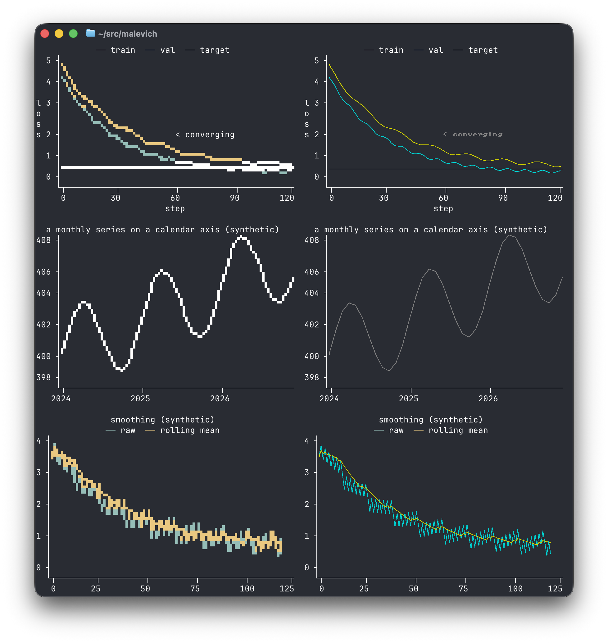
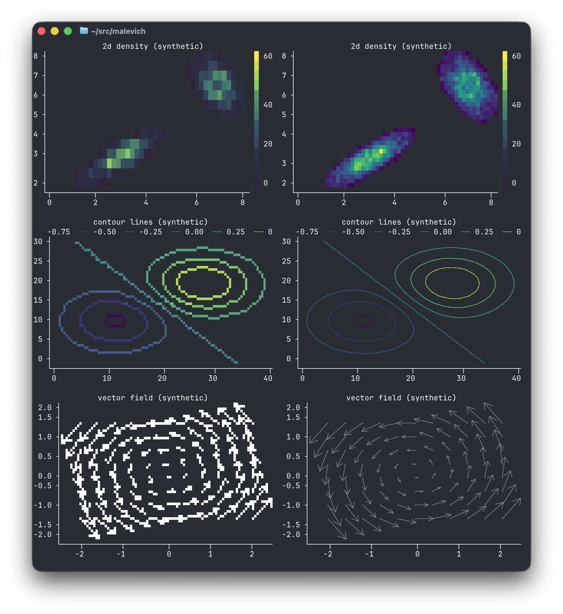
The same plot value, twice. Cells on the left. Real pixels on the right, where the terminal speaks sixel, kitty, or iTerm2. Title, axes, and legend stay text.
One call, then the lid comes off#
The front door is a preset. You can walk through it without knowing the grammar. line(&values) and Plot::new().layer(Line::y(&values)) are the same call, the second one with the lid off, and moving from one to the other doesn't change a byte of the picture.
println!("{}", malevich::line(&[1.0, 5.0, 2.0, 8.0][..]));use malevich::{Frame, Line, Plot, Rule};
let steps: Vec<f64> = (0..100).map(f64::from).collect();
let loss: Vec<f64> = steps.iter().map(|s| 4.0 * (-0.05 * s).exp() + 0.4).collect();
let chart = Plot::new()
.layer(Line::xy(&steps[..], &loss[..]).label("loss"))
.layer(Rule::h(0.5).label("target"))
.title("training");
println!("{}", chart.render(&Frame::plain(60, 14)));Plot::render never fails. When the frame is too small for a title or a legend, those go first and the data stays. Frame::plain gives a test the same string every time. Frame::detect() colors it and sizes it for the terminal you are actually in.
Eight marks, and that's the catalog
Line, Points, Bars, Area, Cells, Range, Rule, Text. Give them a statistics layer and shared scales, and a histogram, a box plot, a density are words you spell. A preset is the short spelling. A test checks that both spellings print the same bytes.
Every brag has a test behind it
The true chart draws every point. The fast one has to land on the same pixels, including a spike one sample wide. A published number has a benchmark behind it. A chart in the docs was drawn by the program, and the build diffs it.
A bad terminal still gets a chart
Real pixels when the terminal can draw them. Otherwise octants, quadrants, then ASCII, which always works. It never fails, never sends a probe where escapes aren't safe, and never takes over the screen. A pipe gets text a log, a diff, or a language model can read.
Three doors#
Rust
A plot is a value. Printing it looks at stdout and picks a frame. The playground writes this program for the numbers you paste, and kaz --emit-code writes it from a pipe.
bar is the short spelling.kaz
A column of numbers in, a chart on stderr, the data still flowing on stdout. --emit-code prints the Rust that would draw the same picture.
hist. kaz hist bins it the same way.cargo install malevich-cli
cat loss.tsv | kaz line --emit-codeJavaScript
The same engine, compiled to wasm, on npm. The Ink widget shares the ratatui adapter's gestures: zoom, pan, and crosshairs, without owning the terminal.
scatter. The npm package exports the same preset.Five things people do#
- Pipe a column through
kaz. The plot goes to stderr. - Drop a widget in ratatui. The plot does not own the screen.
- Repaint a chart as the numbers keep arriving.
- Color by a category. The legend and, without color, the marker shapes.
- Put time on an axis. Hours, days, or years, from the span.
If you have a shape of data and want the spelling, which chart is the plate for each preset.
The name#
Kazimir Malevich painted a black square on a plain ground and meant it: a small vocabulary of geometric forms, composed deliberately. That is the design budget of this library — and, as it happens, a fair description of a terminal, which draws everything it will ever draw from a grid of small rectangles.
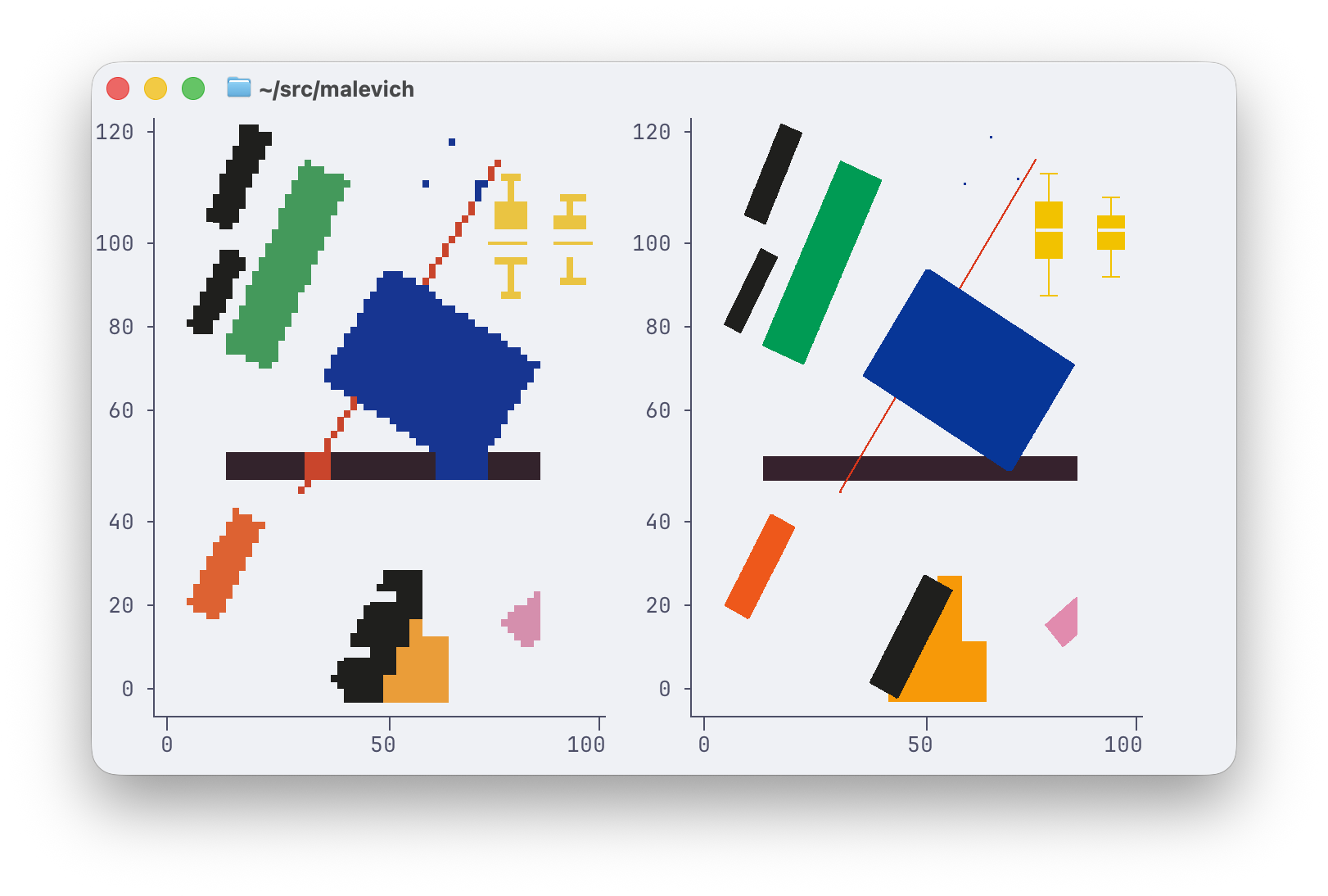
One plot, two fidelities. Rectangles, composed. The cells are on the left. The pixels are on the right.